
Purpose:
UI/UX Case Study
UI/UX Case Study
Software Used:
Photoshop CC, Illustrator CC, Adobe XD
Photoshop CC, Illustrator CC, Adobe XD
---
Overview
The purpose of this case study is to analyze the new Danger Zone game mode in CS:GO and identify pain points that can be solved by UIUX improvements. This mode features a new map called Blacksite where you can drop in and battle against 18 players in battle royal style.
In my case study I will walk-through my thought process on how to improve the experience starting by recording observations based on player personas and extracting qualitative data. For this exercise, the personas are based on feedback received from players online and observations on twitch streams.
User Personas
The PUBG Enthusiast
Age: 32
Quote: “Victories don’t feel as rewarding […in comparison to other BR games]”
Observations:
1. Player kept mashing the ESC button at the end instead of reading the stats info
2. Player used the map viewer profusely
The Twitch Streamer (w/Squad)
Age: 24
Quote: “...Where are we spawning? [Red Enemy zone appears on the map] Did we choose that?”- first drop into Danger zone map
Observations:
1. Player was unsure of how to use drop zones
2. Player kept clicking on a squad member's drop zone in an attempt to join them
The Twitch Streamer (Solo)
Age: 24
Quote: "I don't know how to get ammo!" - after running out of bullets for the first time
Observations:
1. Player rarely encountered ammo in the map
2. Player resorted to buying grenades shortly afterward. Note: ammo was greyed out in the buying menu and may have been unnoticed
3. Player was resourceful and able to survive at least until 8 players were left
The ForTnite Enthusiast
Age: 18
Quote: “Ammo is too limited. I usually end up in a fist battle in the early rounds”
Observations:
1. Player rarely used the tablet to buy anything
2. Player often jumped around, despite losing forward momentum
3. Player was aggressive and did not explore buildings
The Gamer Dad with limited time to play
Age: 35
Quote: “I didn’t find a single gun in the 4 times I played that game”
Observations:
1. Player was keen on staying in the foliage areas of the map to stay hidden and often missed crates without realizing it.
2. Player did not appear to be savvy with computers or personal devices
User Pain Points
1. First-time Squad Players are generally confused by the drop zone selection screen
2. Inexperienced Players often die in the early game session of a game without possessing a weapon.
3. Inexperienced Players often forget to manage their ammo in the heat of battle.
4. Most Players cannot find weapons and ammo when they need it most.
5. Most Players don’t feel a sense of accomplishment for completing the round unscathed.
6. Most Players cannot relate to the new mode at a glance.
Goals
1. Improve Awareness of Tablet Functions
A. Increase awareness of Map functions that inform the player on how to traverse safely until they find a weapon
B. Increase awareness of Buying functions when the player is in dire need of something like ammo or health
2. Improve the first impression of the Danger Zone GAME MODE
Improve first time user experience (FTUE) to Danger Zone to incorporate more educational visuals to help players get up to speed in a non-intrusive manner
3. Improve sense of accomplishment for Victories
A. Re-factor the end-game breakdown to prioritize player’s glorious details over eliminated parties
B. Refine end-game stats to use animated transitions to breath life into accomplishments and introduce stats in a manageable pace
Ideation
Wireframes and flow charts TBD


Proposal 1
A. Re-Design the deployment feature
Purpose: to improve tablet awareness for occupied zones and the buying feature in the tablet
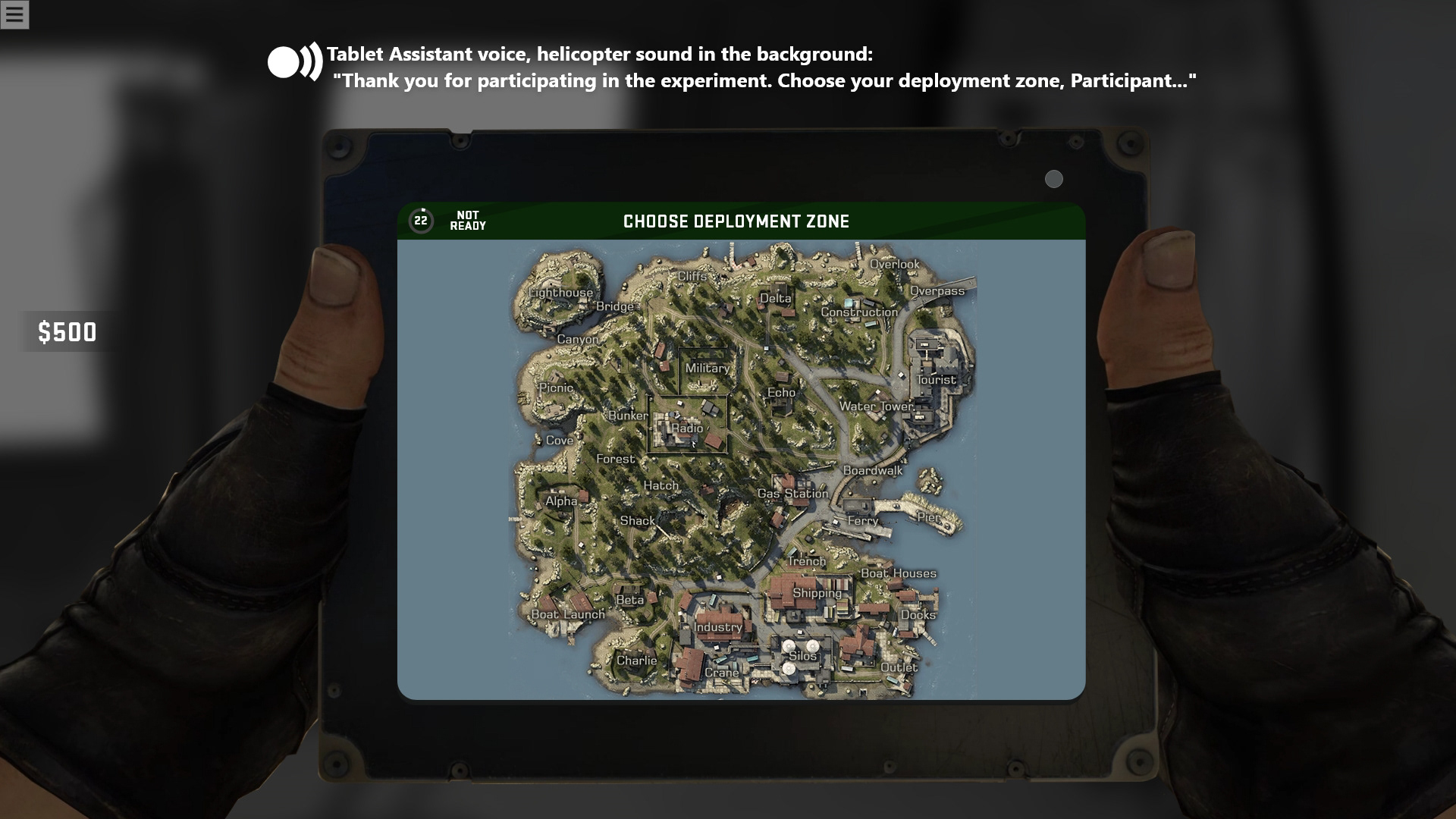
Deployment screen updated to start familiarizing the player with the tablet right away
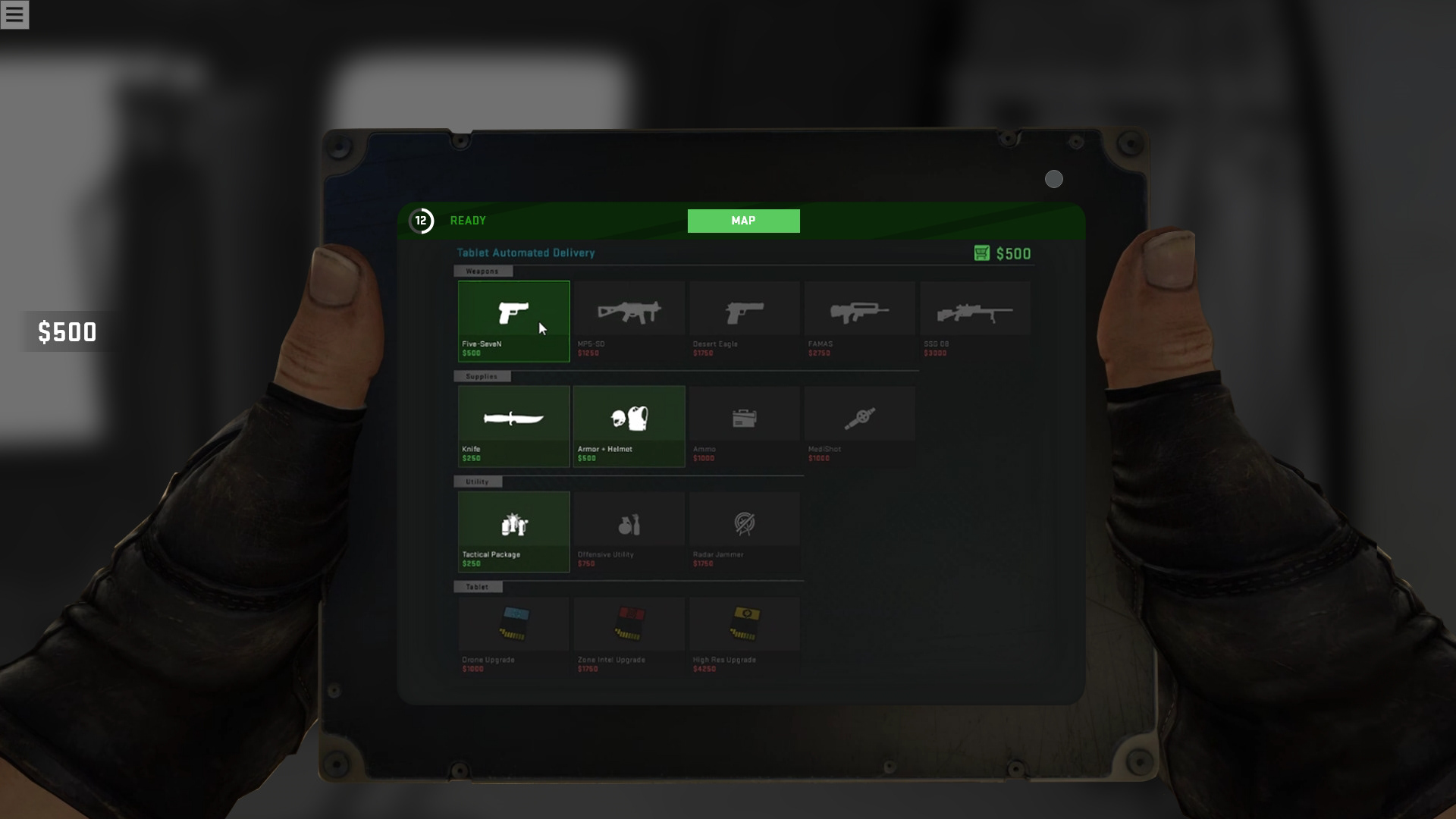
After a deployment zone is selected the tablet leads the player into the buy menu to help acquaint them with the purchase flow of the game mode
Prototype
B. Re-Design the tablet to include a notification system
Purpose: to improve tablet awareness and ease of use for purchasing items in a timely manner
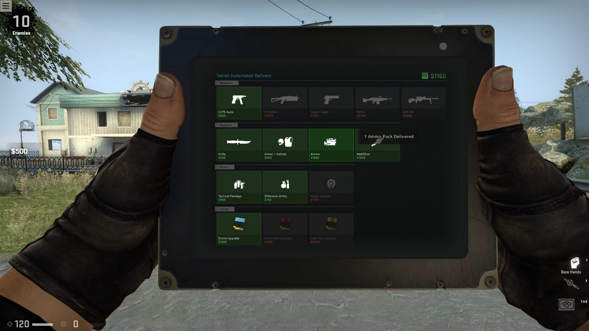
Placeholder image
Proposal 1B
Re-Design the deployment feature
Purpose: to improve tablet awareness for occupied zones and the buying feature in the tablet
<Images TBD>
Proposal 2
Revise front-end menus
Purpose: to improve visual presence of Danger Zone feature for first time users
<Images TBD>
Proposal 3
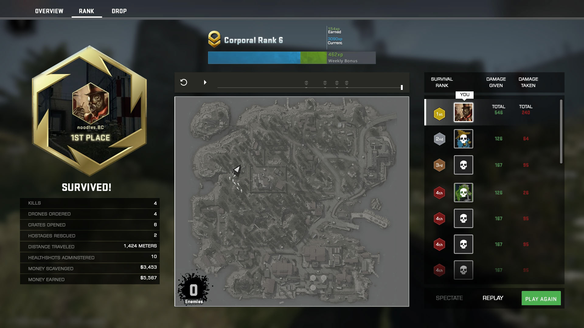
A. Re-design the end game victory screen
Purpose: to improve the sense of accomplishment

Victory screen re-designed to include a map to allow players to review the session via a new timeline feature
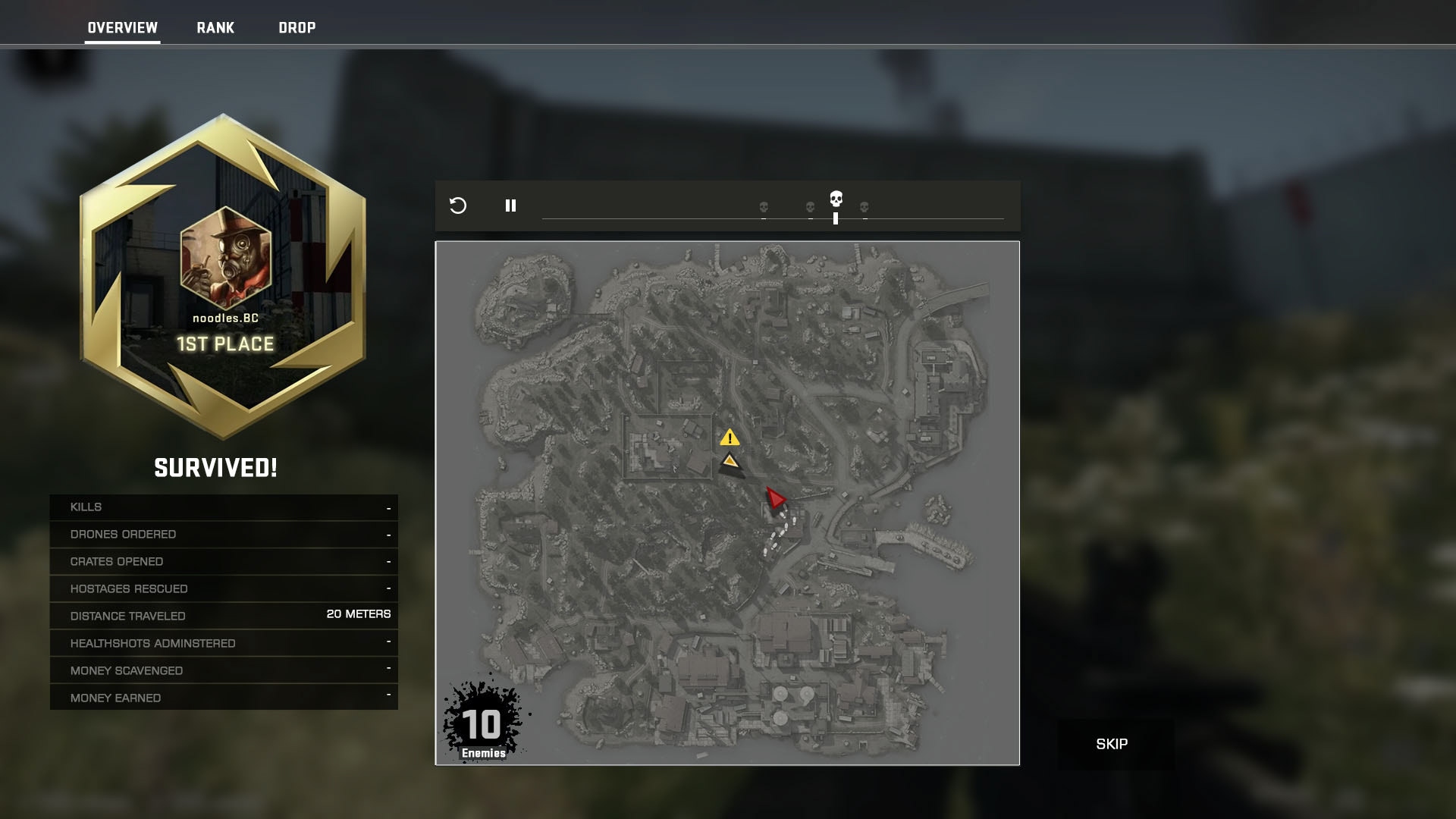
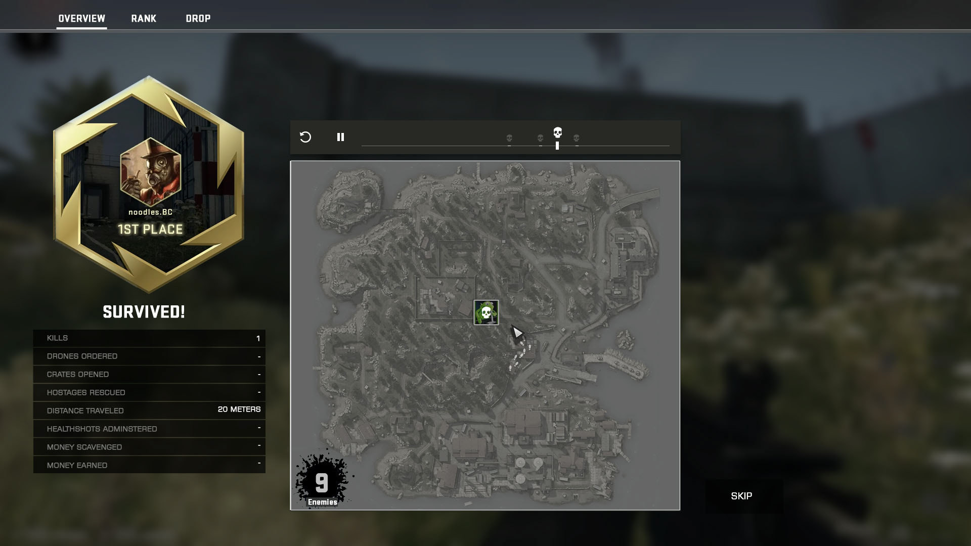
Scrubbing or playing through the timeline will show a play by play of any encounters and track stats in the left side bar in real-time as the session unfolds.
work in progress