Purpose:
UI/UX Case study
UI/UX Case study
Software Used:
Photoshop CC, Illustrator CC, Principle
Photoshop CC, Illustrator CC, Principle
---

Overview
The purpose of this case study is to analyze the new Danger Zone game mode in CS:GO and identify pain points that can be solved by UI/UX improvements. This mode features a new map called Blacksite where you drop in and battle against 18 other players until there is only one player or squad remaining.
OBSERVED User Pain Points
1. Most Players cannot relate to the new mode at a glance.
2. Inexperienced players often die in the early game session of a game without possessing a weapon.
3. Most Players don’t feel a sense of accomplishment for completing the round unscathed.
For more context, check out the screencaps below to see the captions for each key moment observed in the flow.
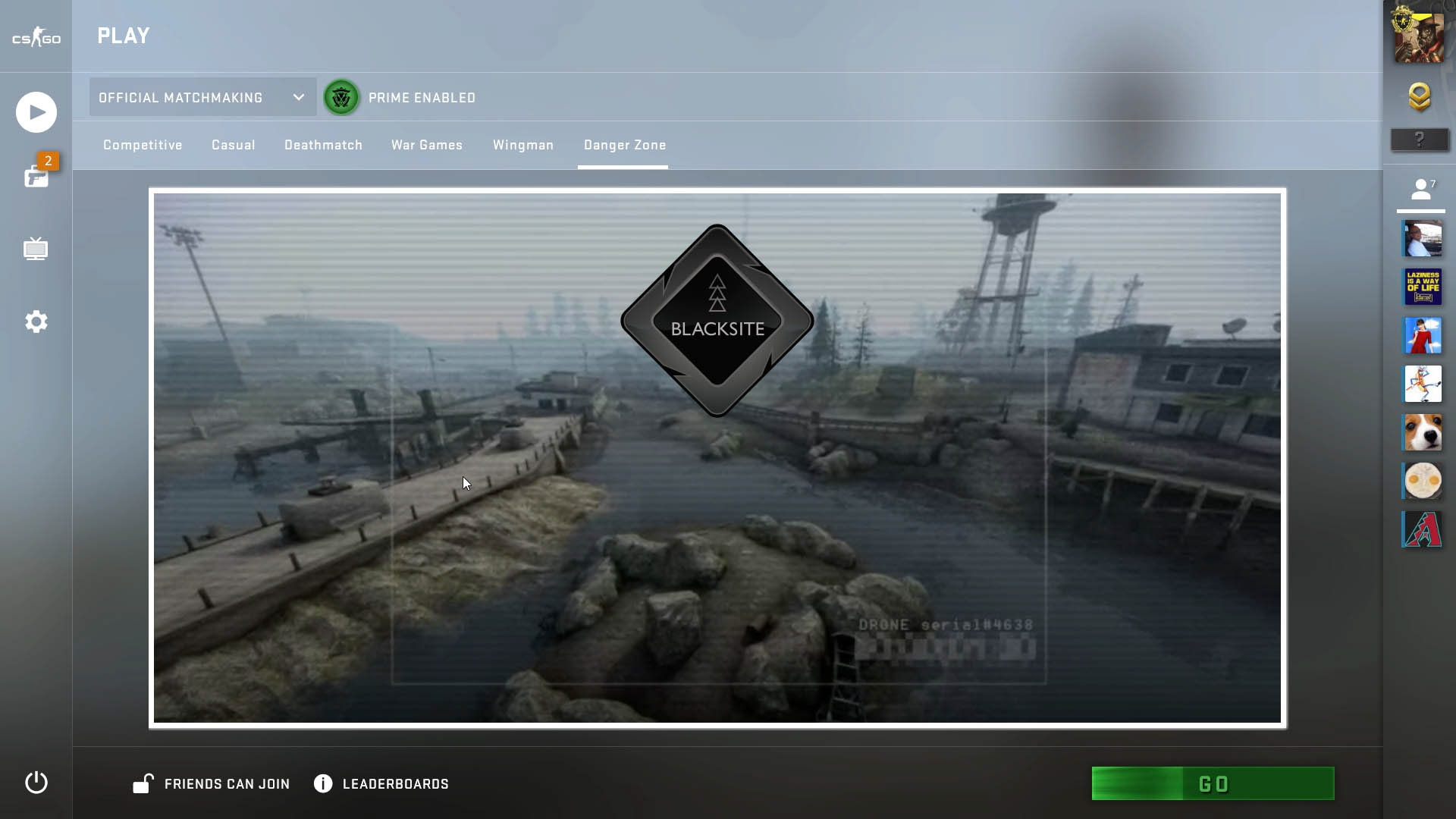
The game mode screen has no information on what to expect in the game mode.
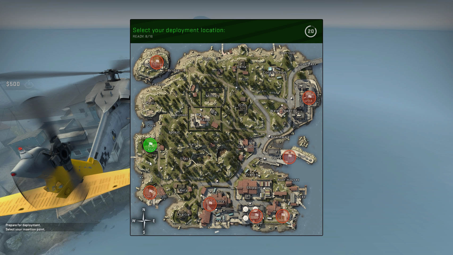
Once the match starts, players need to decide where to land but there is no mention of what to expect
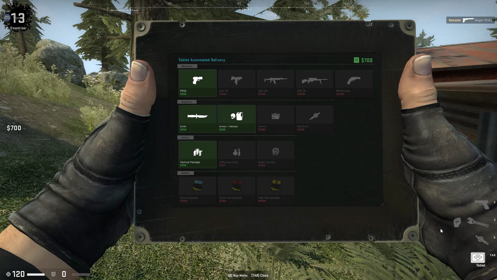
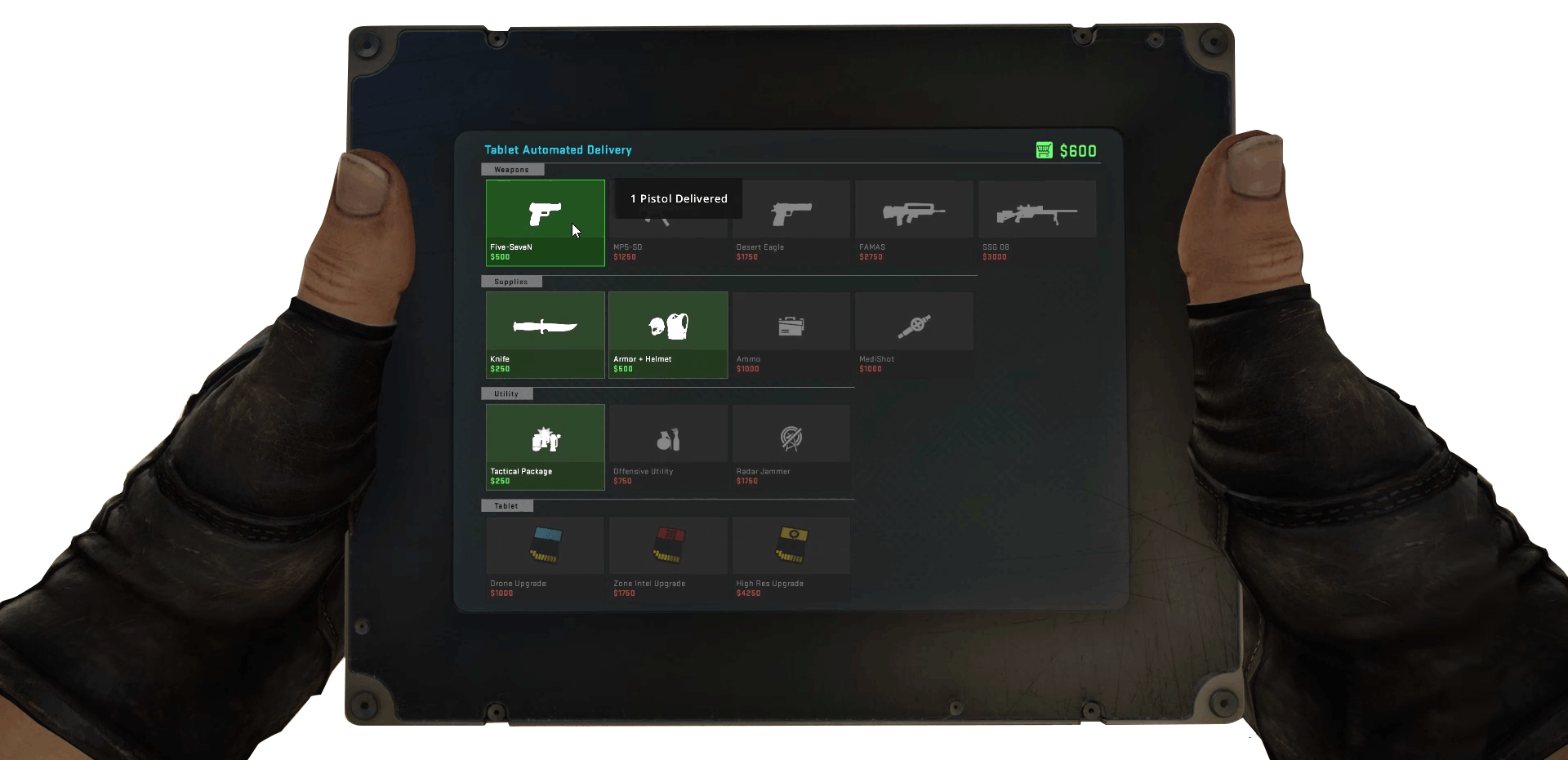
The B button triggers up a tablet screen to purchase items
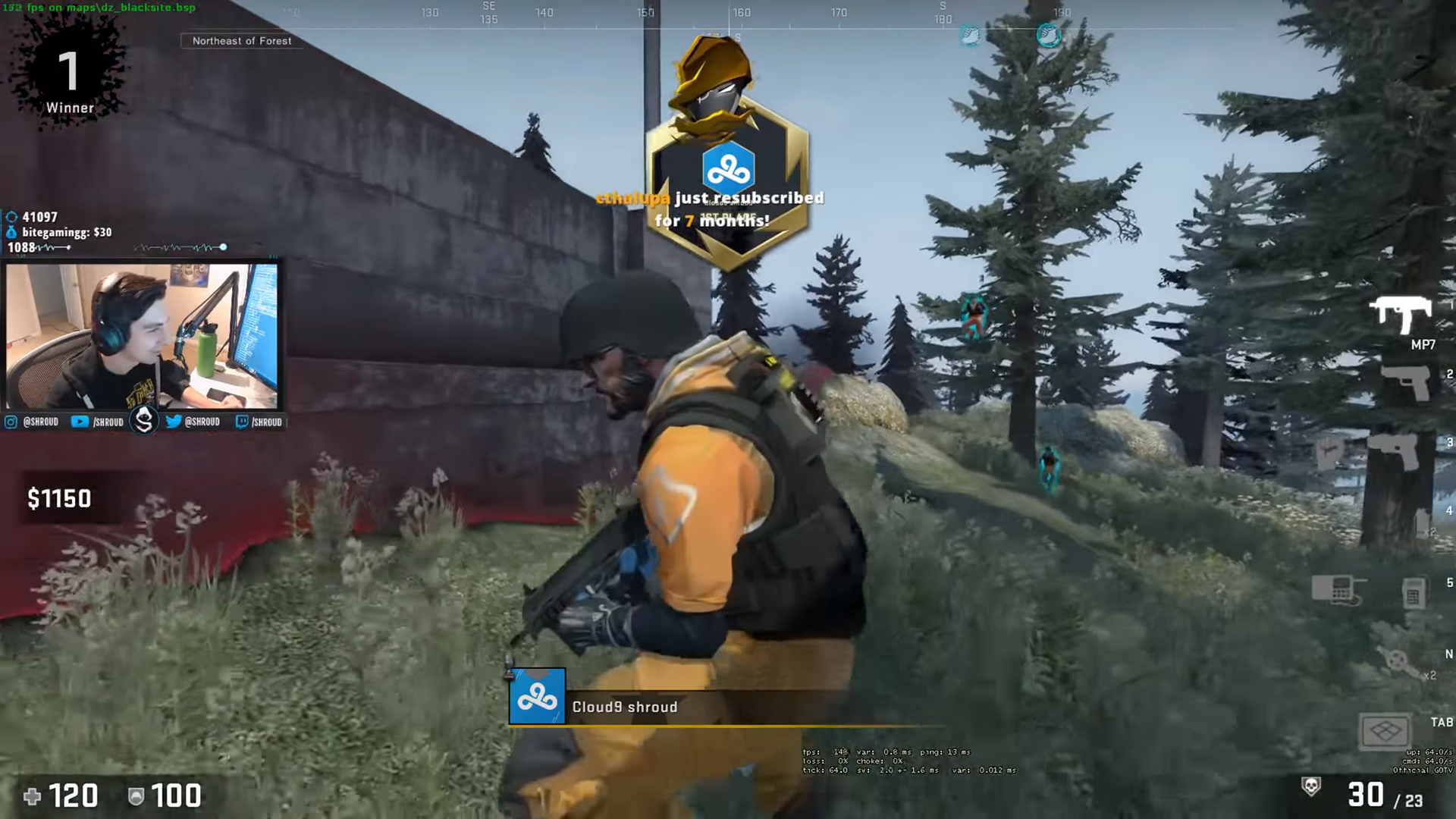
When a victory happens, a brief badge appears at the top of the screen. Players found this underwhelming
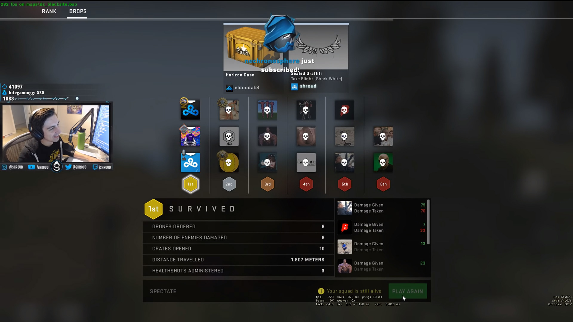
Stats and rank are shown after the match ends but lacks some context on how it related to the overall session
CONCEPT
1. Improve the first impression of the Danger Zone GAME MODE
Improve first time user experience (FTUE) to Danger Zone to incorporate more educational visuals to help players get up to speed in a non-intrusive manner
How: add a discrete info button that can give more context before launching the game mod
2. Improve Awareness of Tablet map and shop Functions
Present a toggle interface to show the tablet can be used in multiple modes instead of relying on memory of key binds.
How it was executed: adjusted the drop-in sequence to use the tablet context and prompt users to buy as their first action while waiting for the start countdown
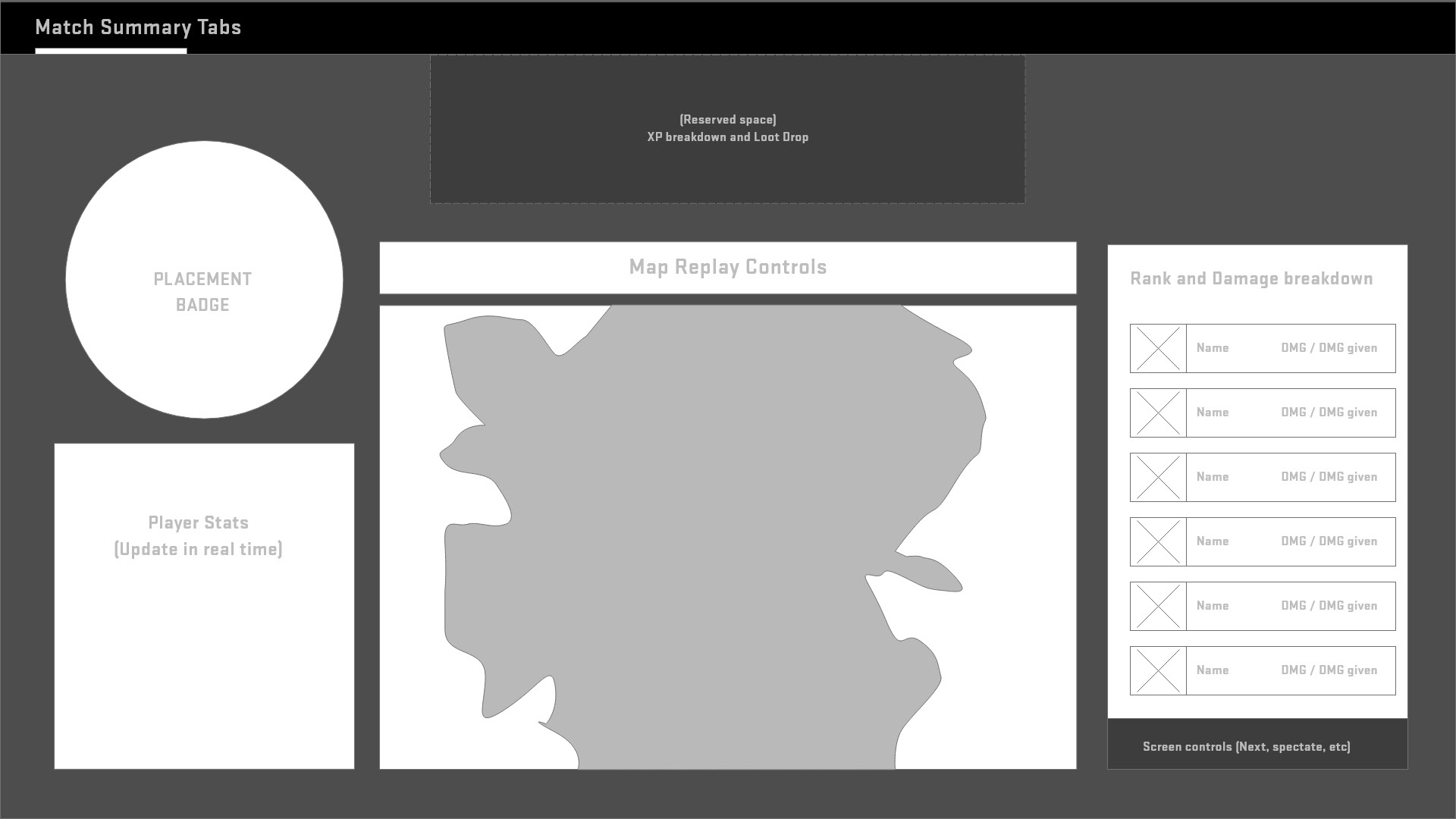
3. Improve sense of accomplishment for Victories
Redesign the end-game breakdown to improve context for amount of damage dealt during the session
How it was executed: show damage next to ranking in a single list that updates based on a visual timeline that marks all deadly encounters until the round ends
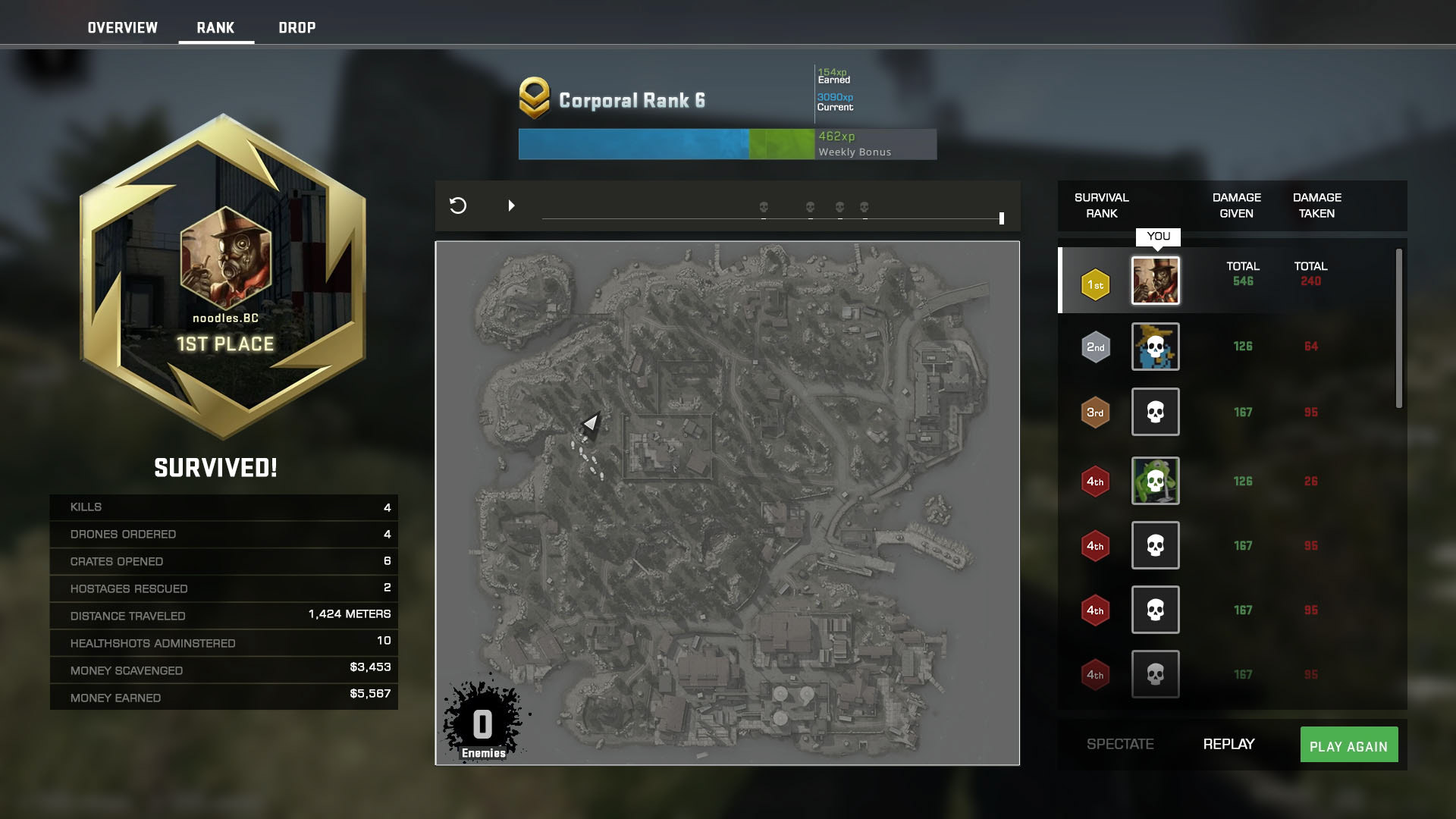
Scrubbing or playing through the timeline will show a play by play of any encounters and track stats in the left side bar in real-time as the session unfolds.
Flow Maps
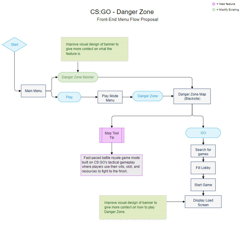
Front-End Proposal
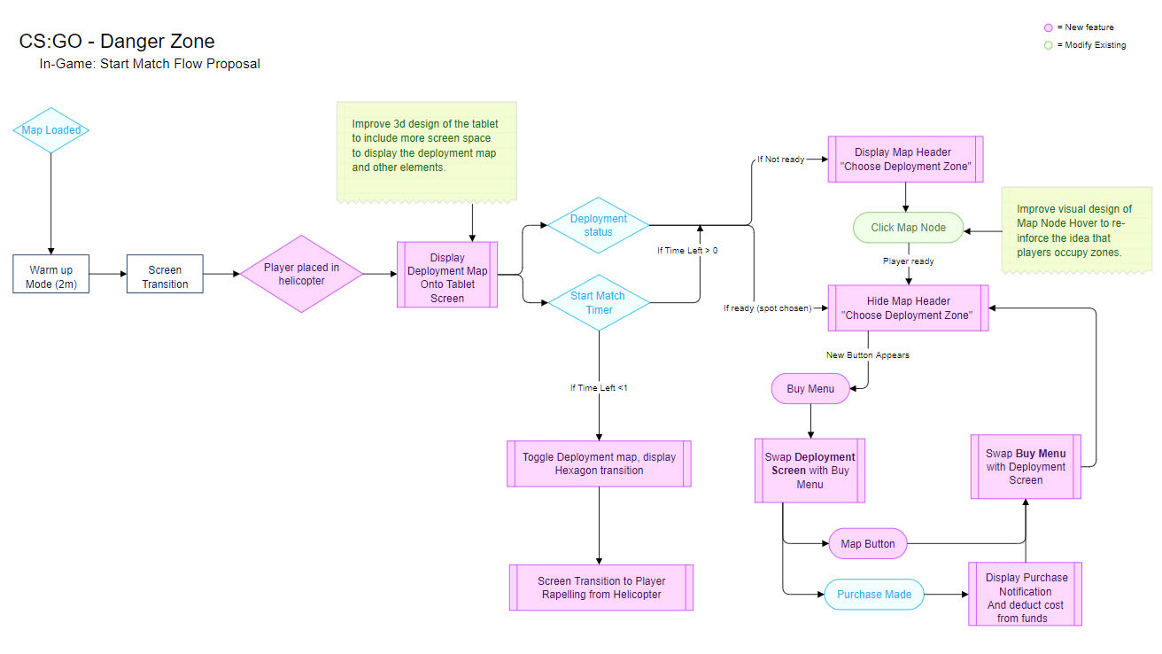
Start Match Proposal
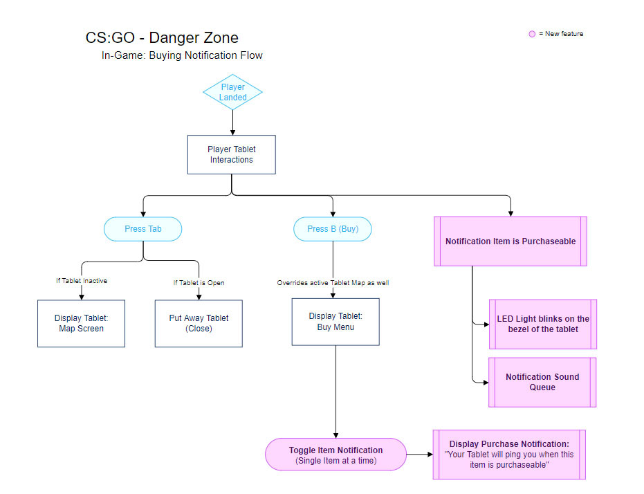
Tablet Buy Menu Proposal
IDEATION AND ROUGHS
Sketches and Wireframes
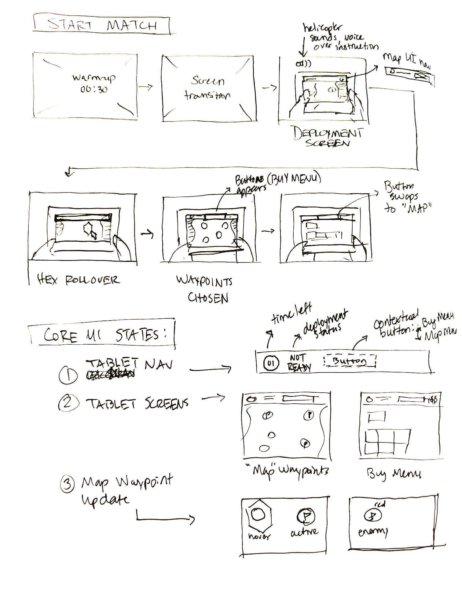
Sketch of Start Match Flow
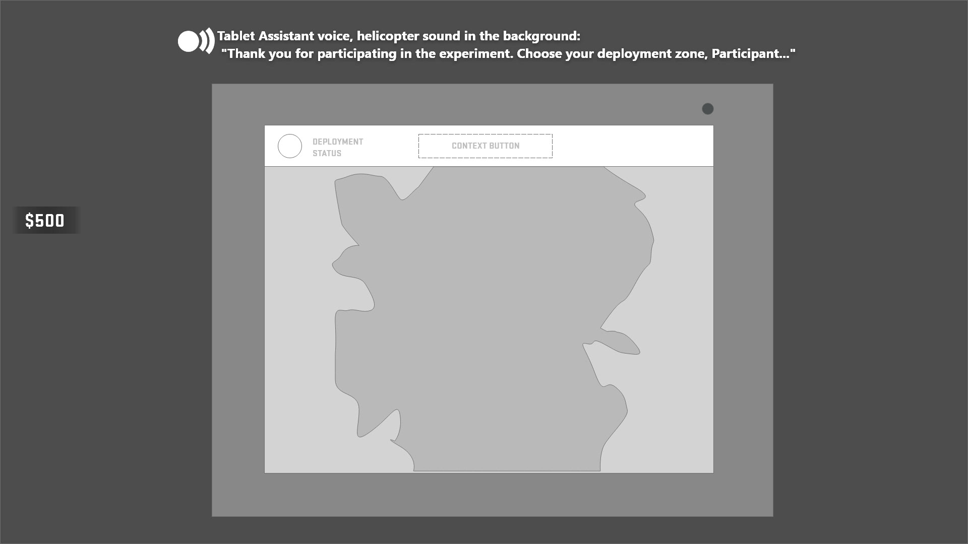
Early wireframe of deployment screen