My Role:
UI Art Direction
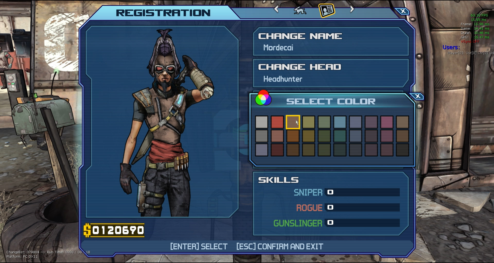
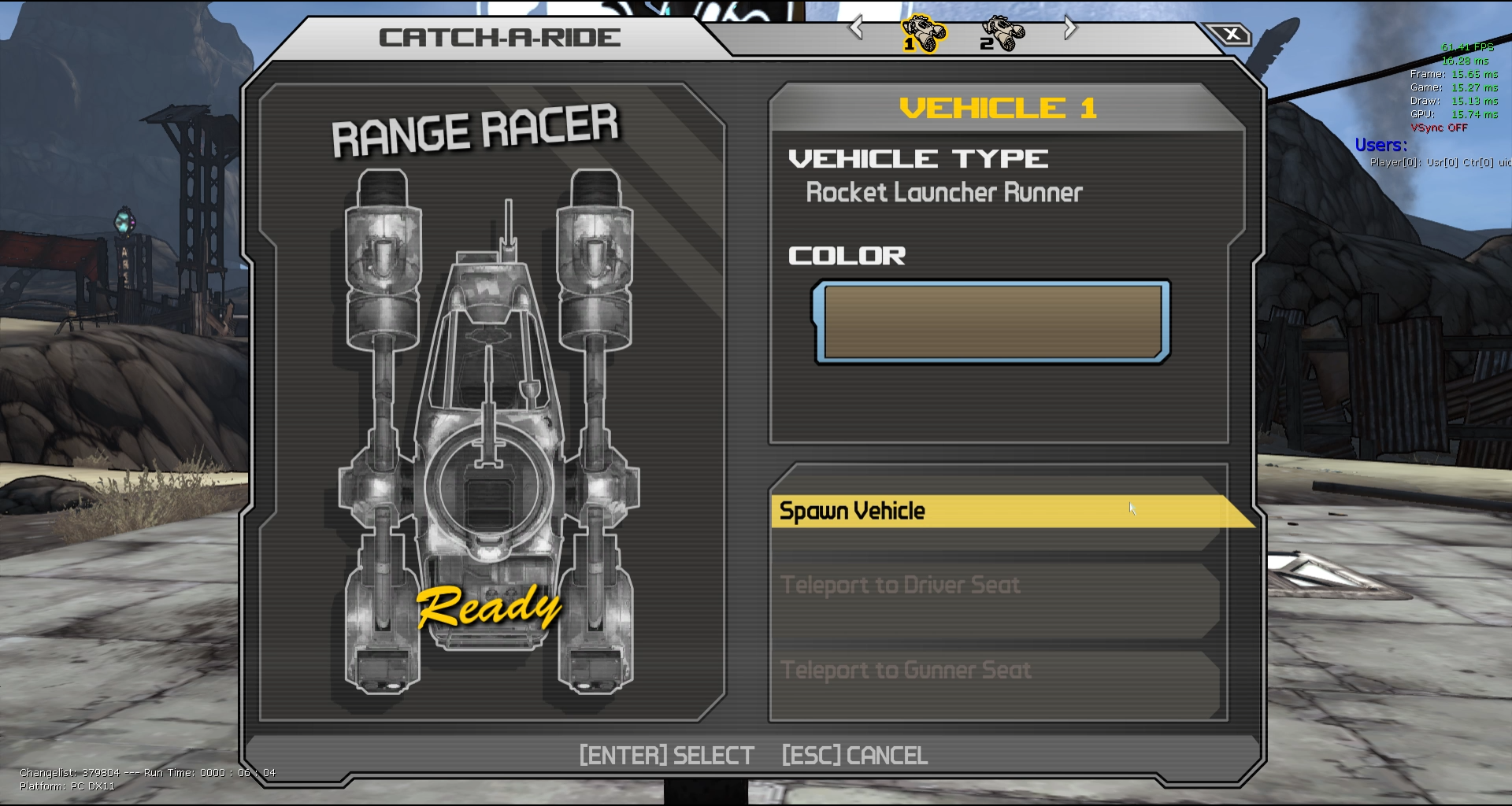
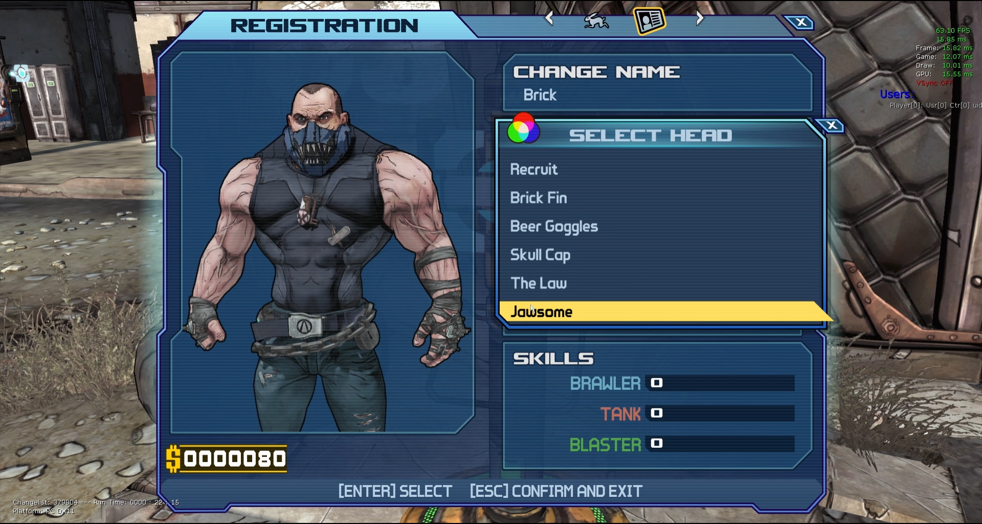
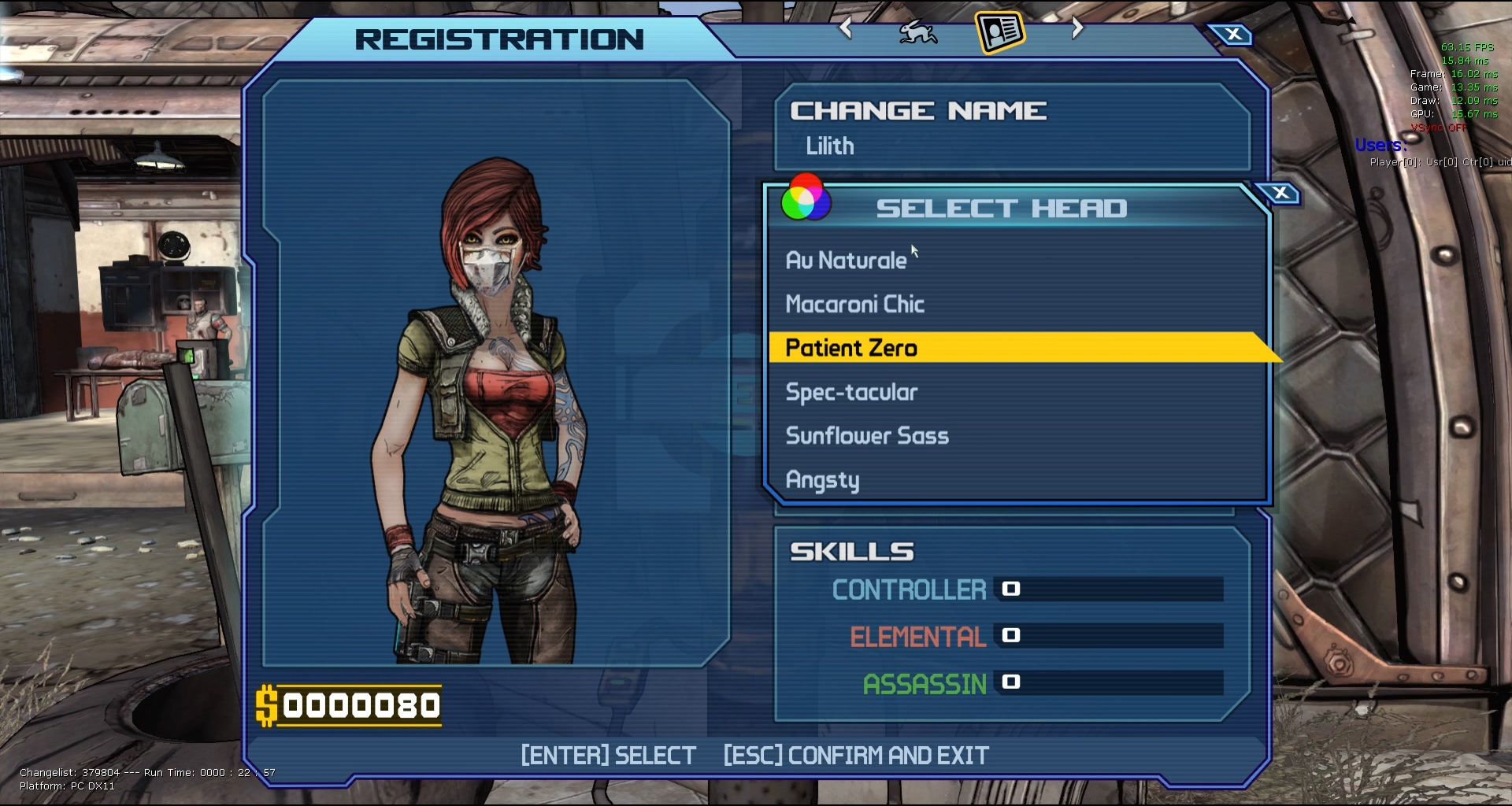
UX Development for New Features
UX Development for New Features
Software Used:
Photoshop CC, Illustrator CS6
After Effects CC, Media Encoder CC,
Flash CS6, Unreal Engine 3, Scaleform
Photoshop CC, Illustrator CS6
After Effects CC, Media Encoder CC,
Flash CS6, Unreal Engine 3, Scaleform
Platforms:
PC, XBOX, PS4
PC, XBOX, PS4
---
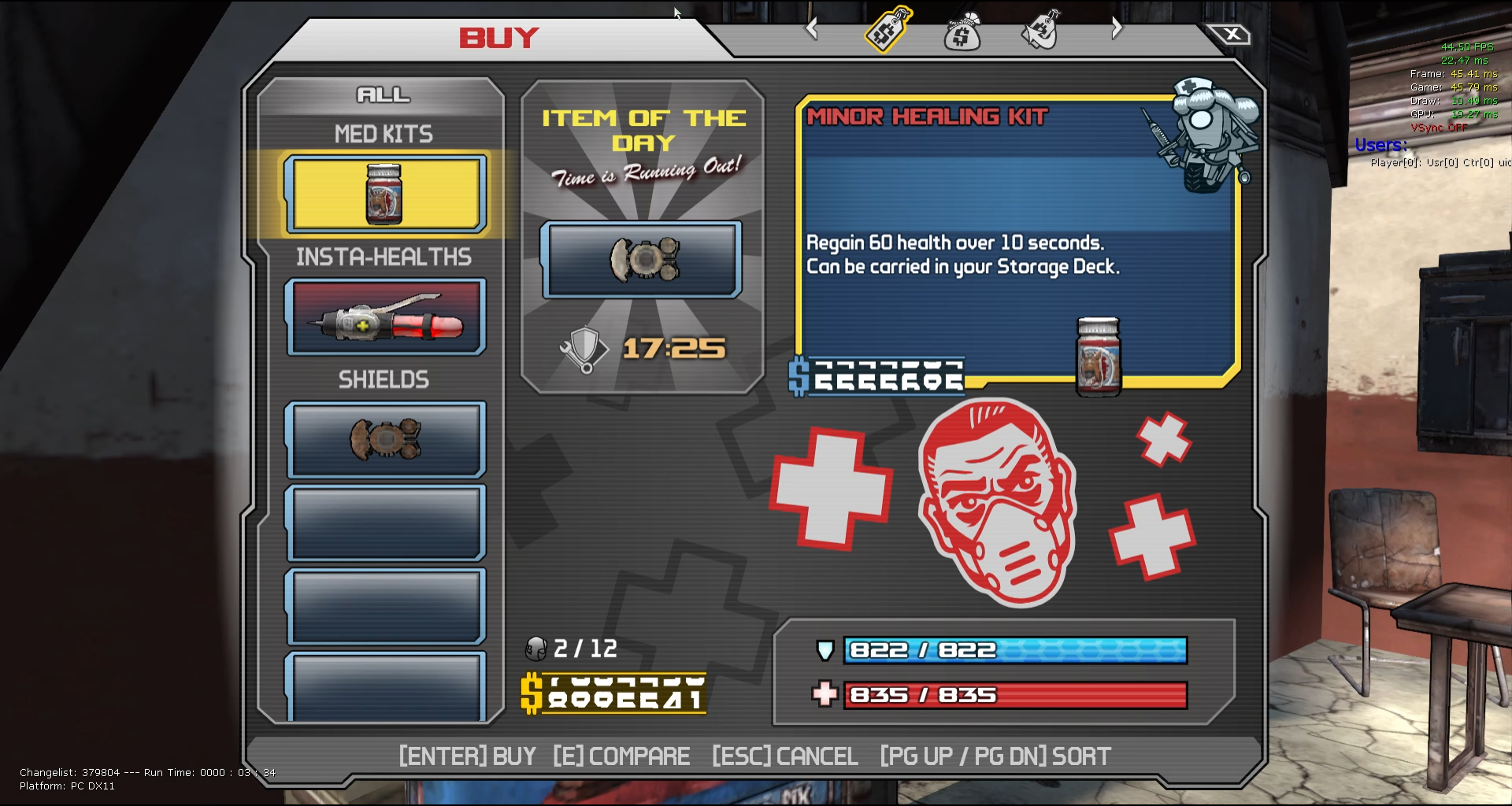
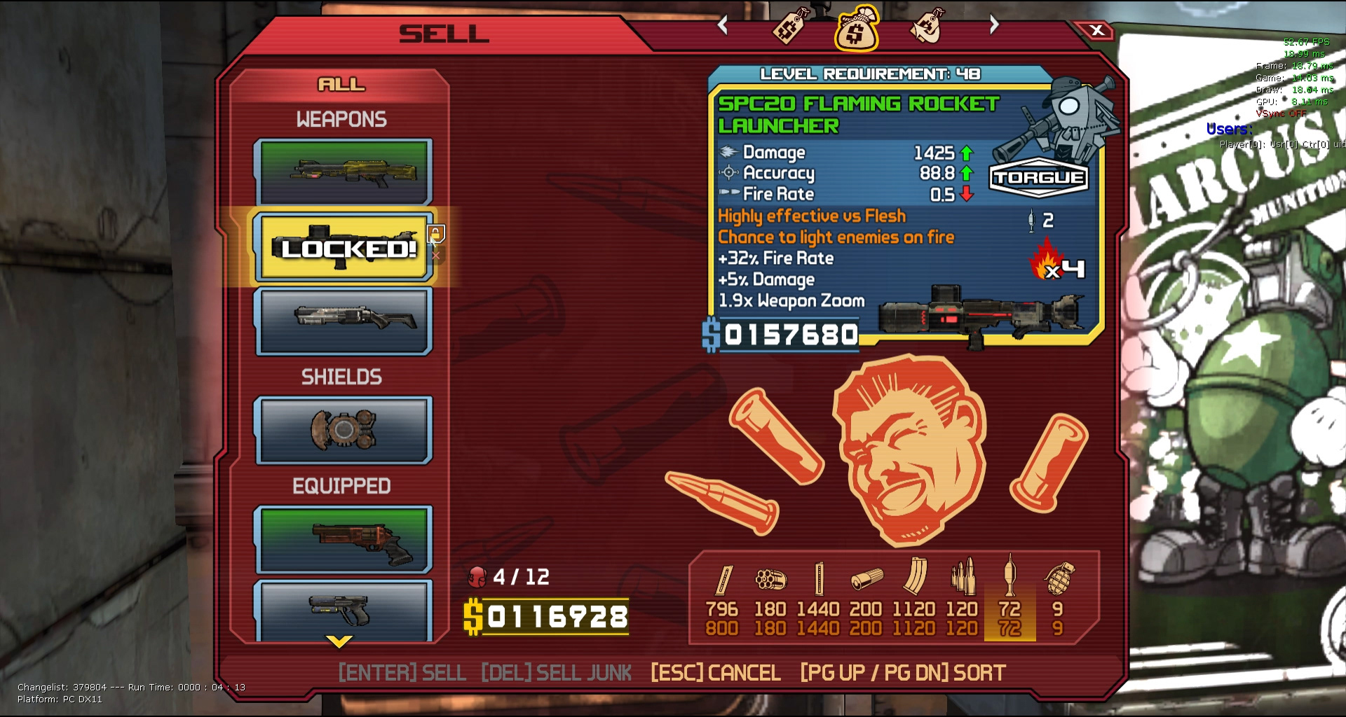
BEFORE AND AFTER REEL
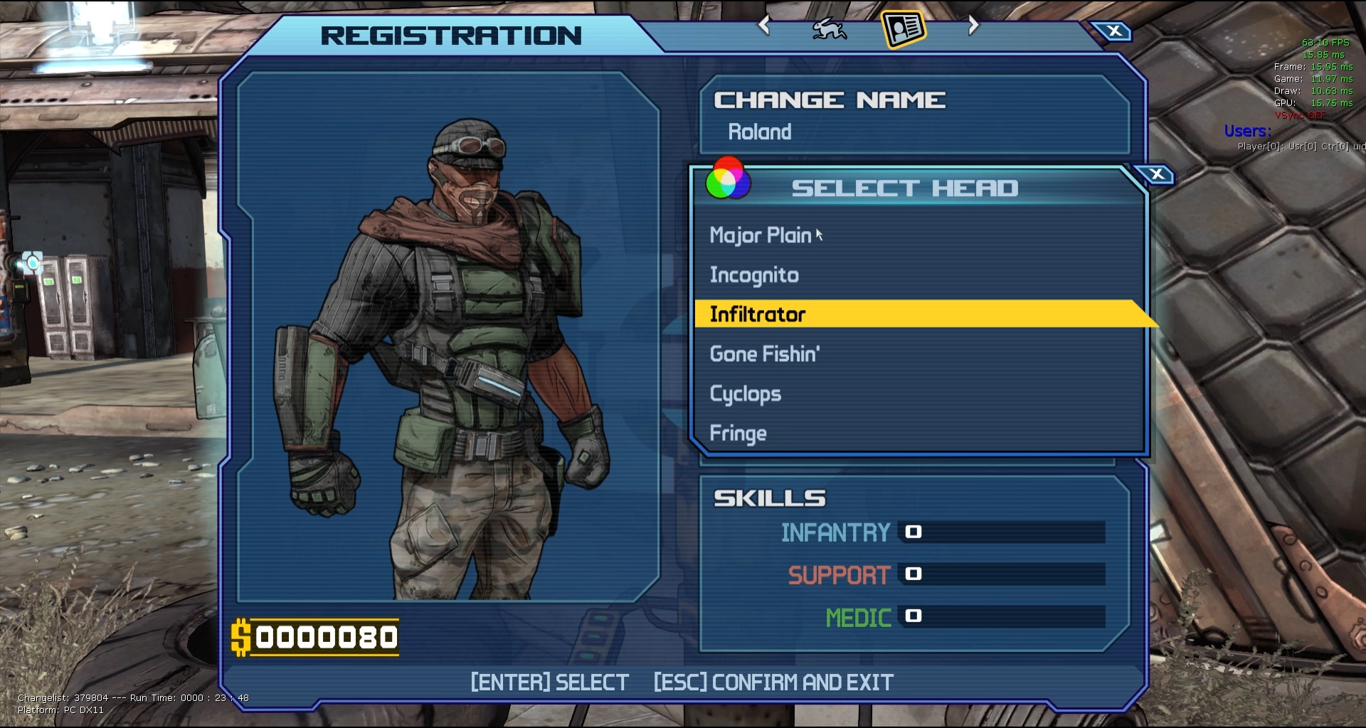
FRONT END REEL (LOBBY)
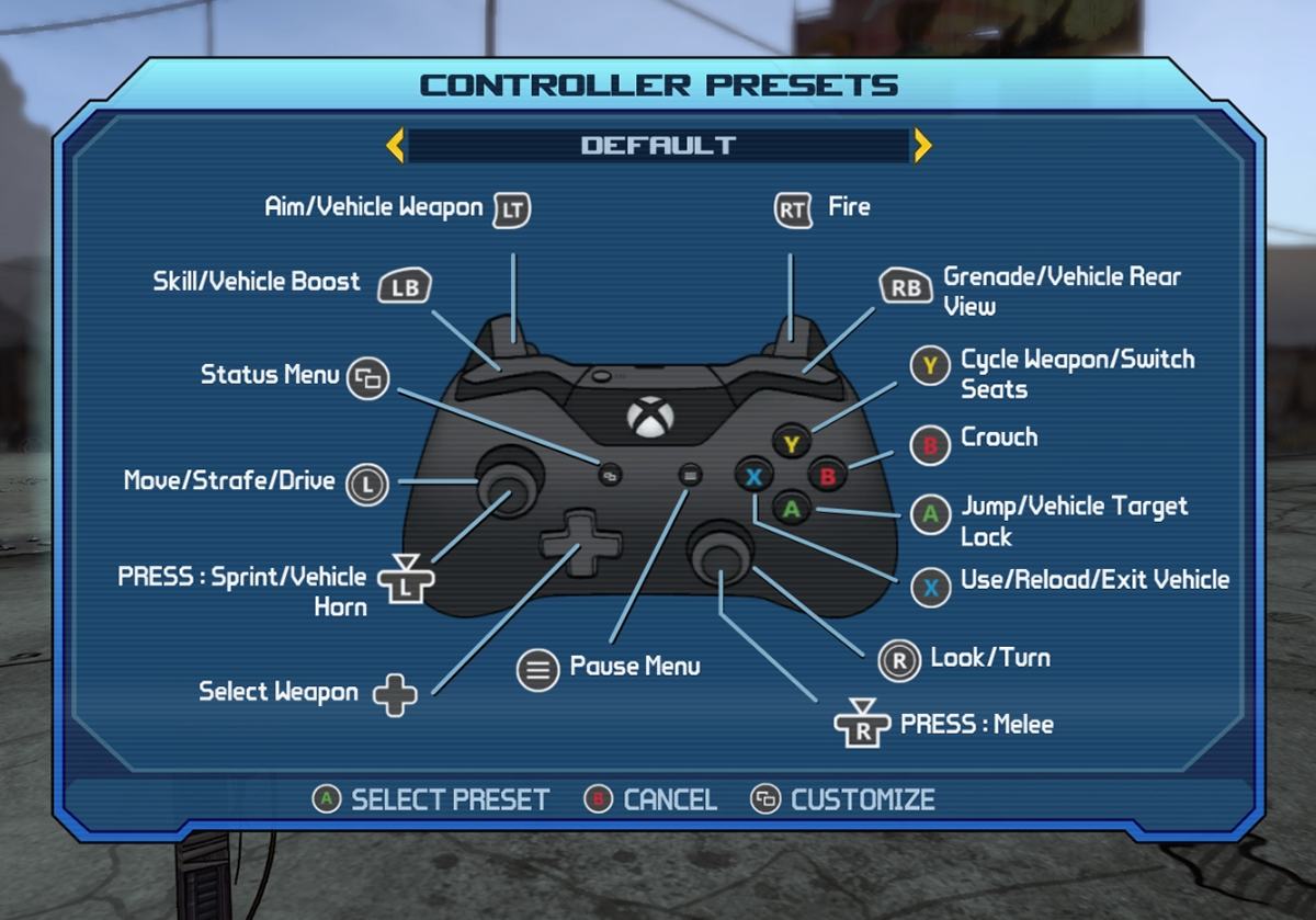
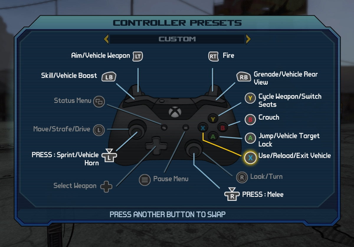
MAIN FRONT-END FLOW
PAUSE MENU FLOW
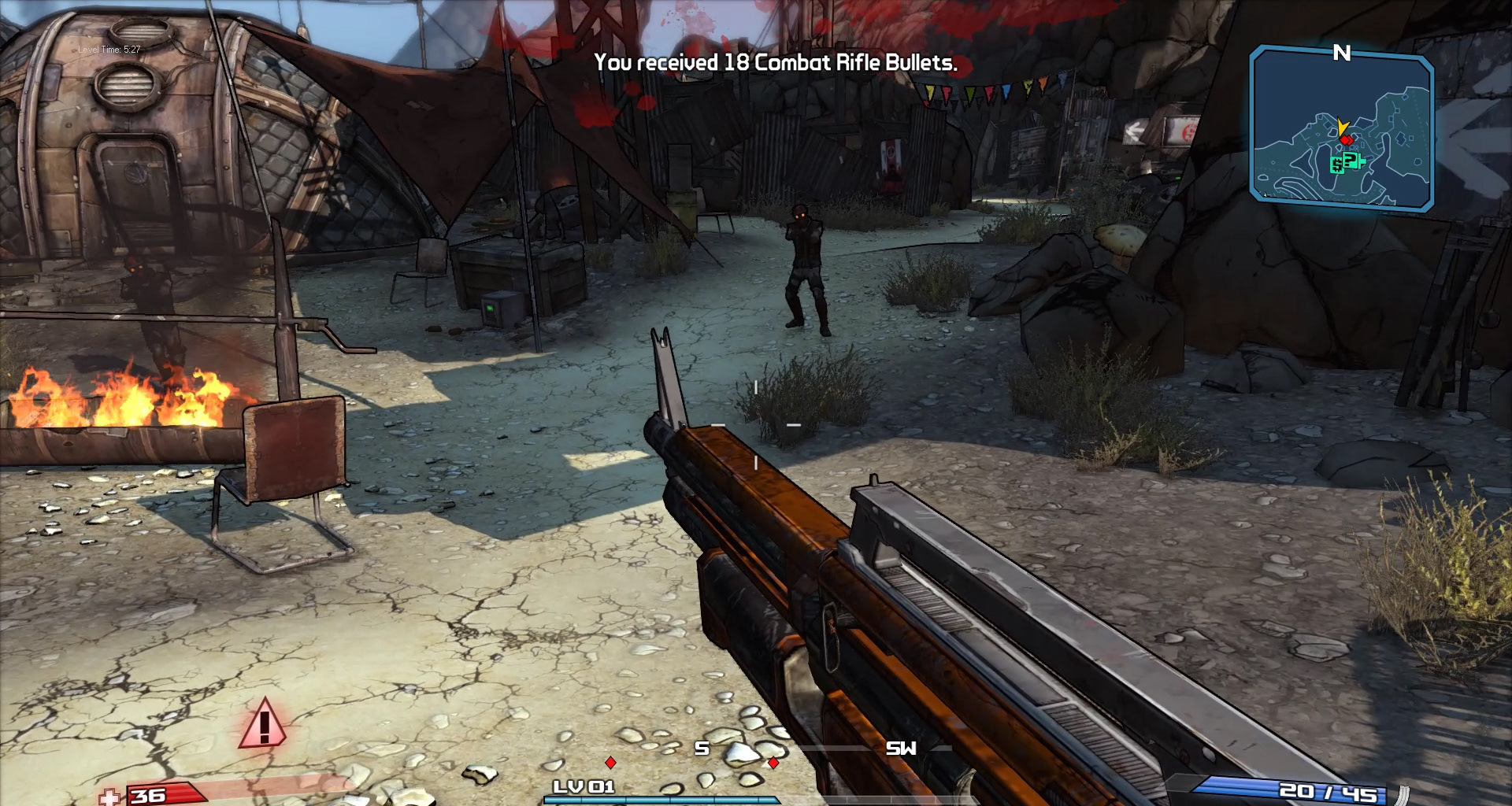
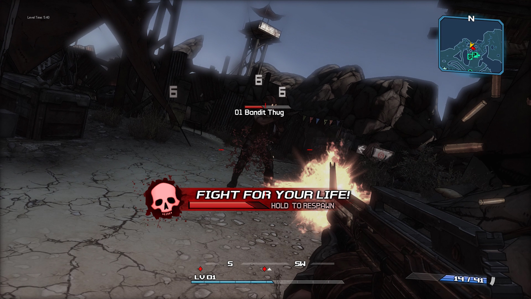
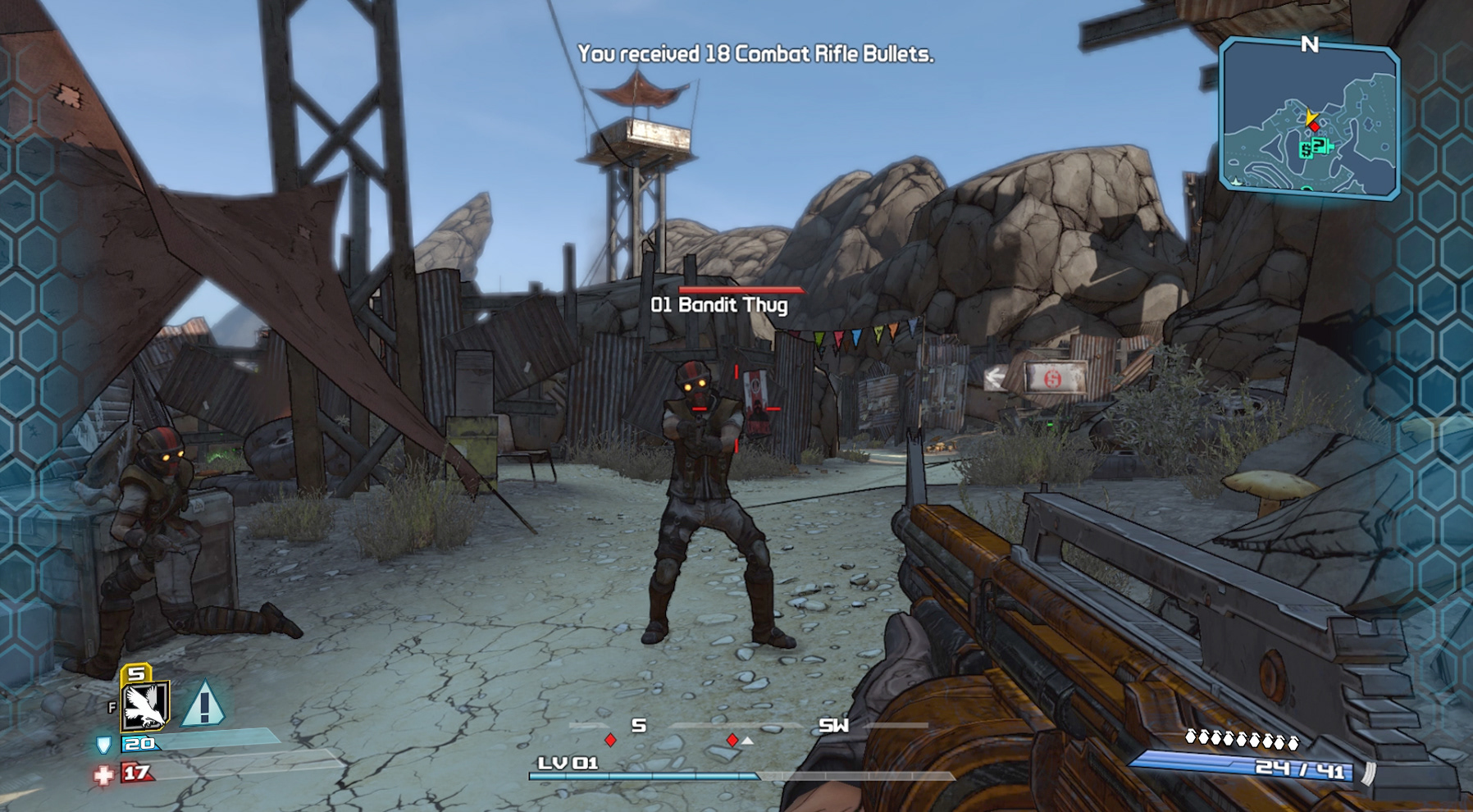
A. re-designed damage indicators
In the original game, a red damage indicator was used for all damage received, including shield and direct damage. This was problematic since both shield and health status use separate bars to measure hit points. To solve this, we added new UI elements to represent shield damage and help distinguish it from direct health damage.
This was represented by a pulsing blue hexagon matrix to signify shield damage and blood splatters to simulate direct damage to the player. These new UI elements helped the player recognize when damage was draining hit points from the shield or health bars on the HUD.
B. Mini-Map
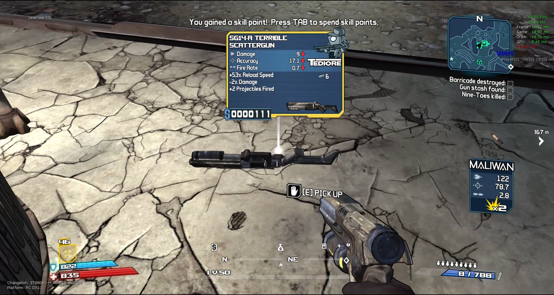
In the original game, players had to rely on the use of a compass to orient themselves to the world and locate and nearby enemies. To improve player awareness and ease of use, we added a mini-map to the top-right corner of the screen to allow the player to see their relative location without pressing pause to see their location on the full map. This mini-map feature also included radar blips for nearby enemies which was much easier to understand were foes are approaching and how to traverse the level properly.
C. Health Indicators
The style of the health and shield bars was refined to include more gradients and glowing elements to help upgrade the look from the plain bar appearance in the legacy version of the game.
D. Ammo Indicators
The style of the ammo quantity bar was refined to include more gradients and glowing elements to help upgrade the look from the plain bar appearance in the legacy version of the game. The grenades received a bolder outline to help them stand out against busy backgrounds.
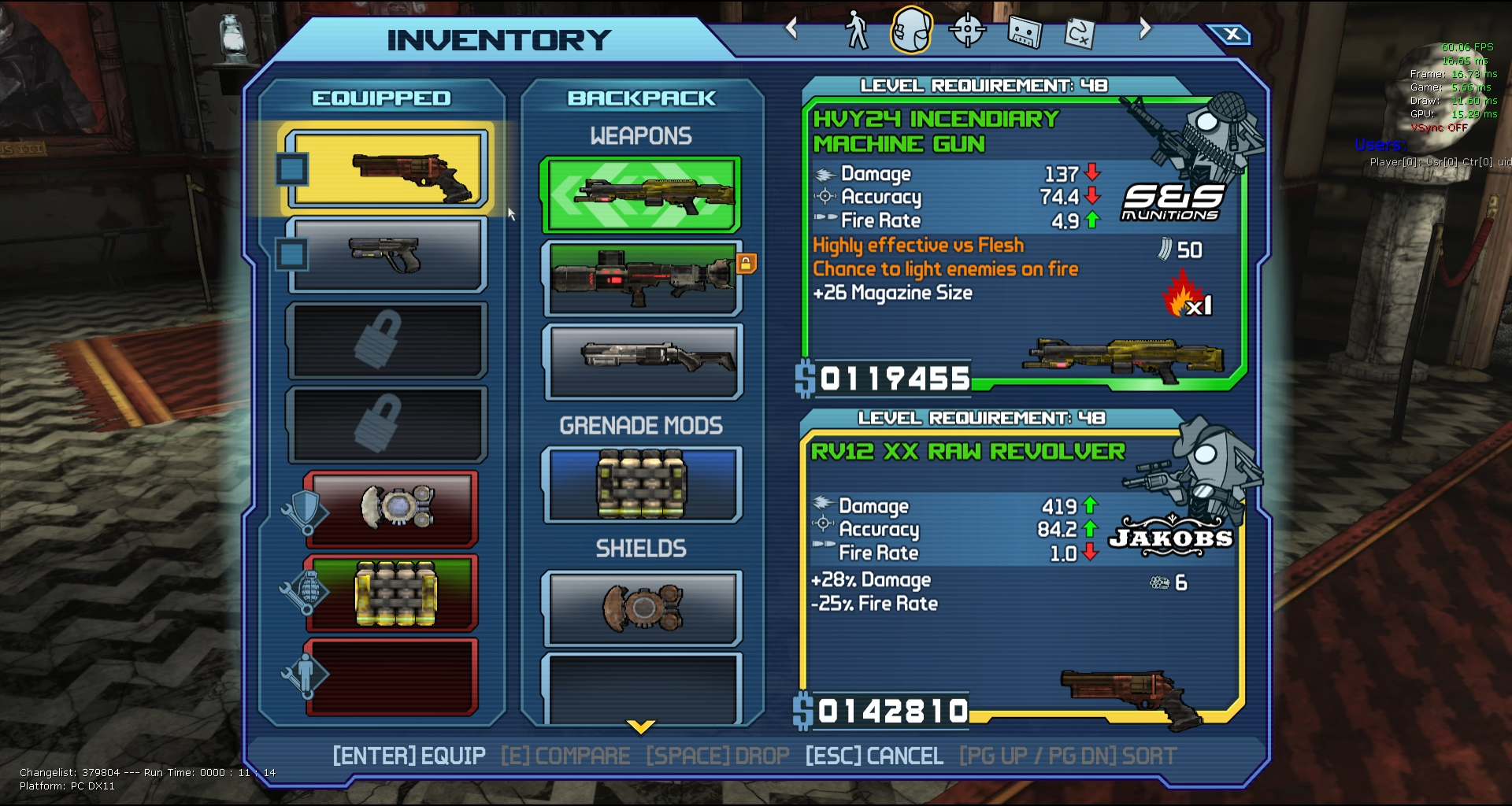
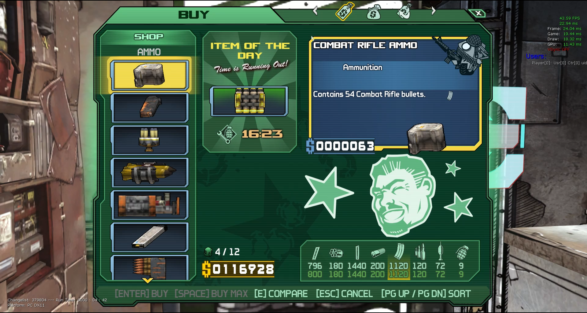
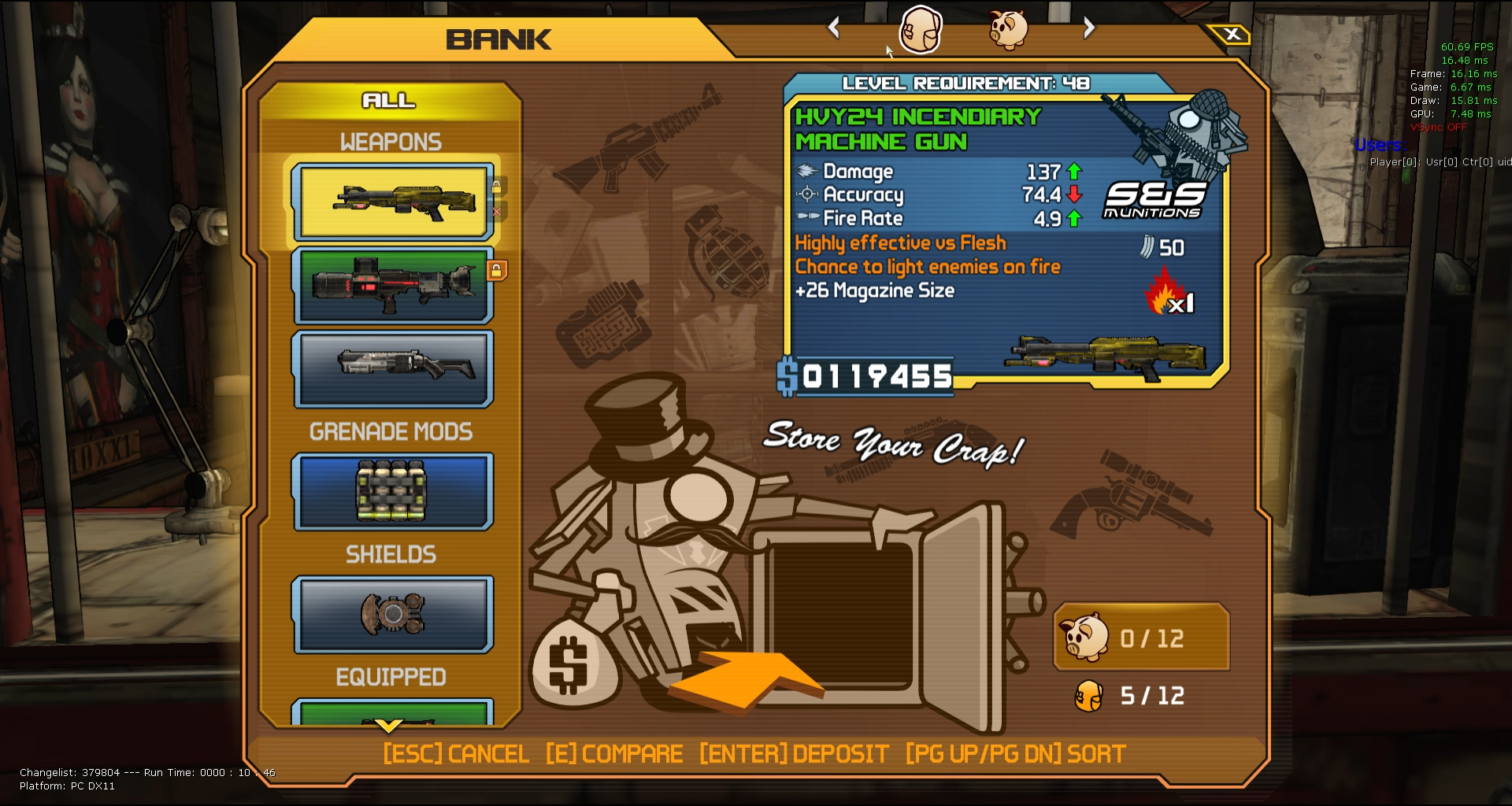
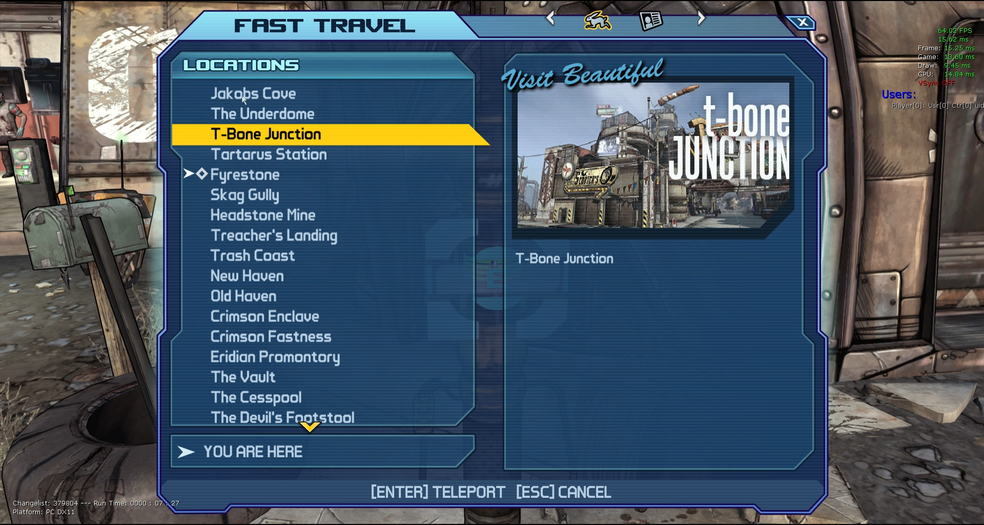
Borderlands featured postcard artwork for each map location to help players familiarize themselves with the world. Unfortunately, the previous artwork was not authored to support modern high-resolution displays.
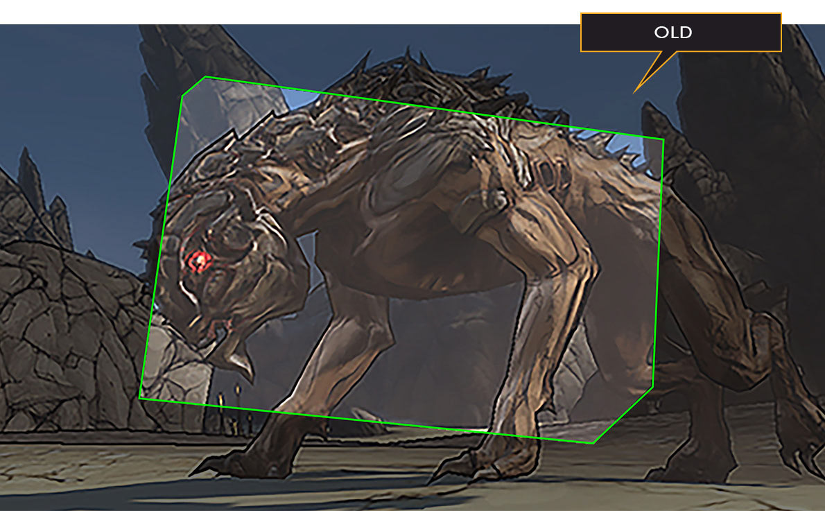
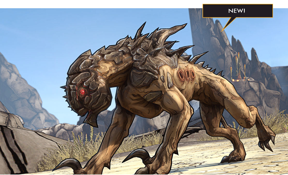
I worked with a team of 3D and UI artists to re-capture the scene in-engine and finalize the compositions into Fast Travel post card graphics and animations for loading transitions.
POSTCARD REEL
Customization Reel
